)
I often get asked about my process both by clients and designers. Like a magician, people want to know how the illusion is performed. Unlike a magician, I have no problem revealing how my magic is done. In this article I’m going to detail the process I use to create icons for the OpenStack Foundation — a free and open-source software platform for cloud computing.
Each OpenStack project needs its own animal icon, and with over 70 projects this is a dream project ?. This is going to be less of a tutorial and more of a ‘behind the scenes’ kind of article. Also, I just want to note that this project is more of an identity system for OpenStack’s many projects rather than a traditional icon set, so you’ll notice that I don’t set up a grid when I start.

For the sake of this post, I will show my process for one of the projects where the team chose a fox as their icon. Other than a brief description of what the product is used for, it was up to me to figure out how best to illustrate this particular animal for the project. Here’s how I went about doing just that.
Step 1: Visual Research
There’s a fine line between drawing what you know and what you see.
On one hand, drawing from knowledge allows you to pull from a sort of collective memory. If you remember it a specific way, chances are others do, too. It’s why icons are so useful — they rely on an idea or metaphor that exists in many people’s minds. The downside is that drawing from memory makes it easy to mess something up.
On the other hand, if you actually look at the thing you are trying to depict, it’s much easier to get proportions right and its legibility is increased; it becomes easier for people to see what it is supposed to be.
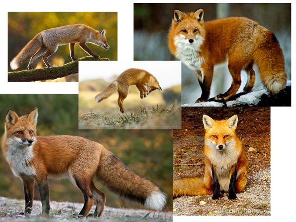
First thing I do is fire up google and search for foxes. Photos of real ones are best, I don’t want to be influenced by any other fox logos or illustrations. I want to see how they look, how they’re built, and even how they move. There are two things that I’m looking for here. First, I want to make sure that a fox looks like what I think a fox looks like. And second, I’m basically looking for enough of a resource to be able to find the geometry in the animal.
Step 2: Sketching
I use sketching to figure out how to best pose the animal and how to break it up into simple shapes. Typically, I start off by straight up drawing it as I see it in the photo. This helps me get a sense of what kind of shape to use for the body, leg, head, tail, etc. You know how in those “Learn to draw” books they start you off with simple shapes and you’re supposed to build up from there? This is the reverse of that. Just start drawing the thing and work backwards.
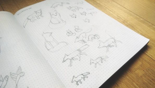
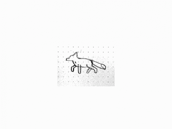
So I’ve sketched the fox in a few poses and I have a good idea of where I want to take it. The dot grid helps me with proportions, but I usually don’t spend time making sure the sketch is perfect before jumping on the computer. Because I tend to use a lot of math in my work, it doesn’t make sense to draw something out with rulers and shit when the computer does the computing for me. I know a lot of people will make sure they’ve figured out exactly how they want their logo/icon to look before jumping on the computer, but I have neither the patience nor attention span for it, especially when I know I can get there faster if I’m plugged into the matrix.
Step 3 Vectorizing
Our work is by no means done. Sketching has gotten us half way there, but as I mentioned, we still need to get the math right.
In illustrator, I make sure my rulers are set to pixels, and start off by tracing the fox using rectangles. I recommend building your shapes out using whole numbers rather than arbitrary sizes, ie. a rectangle is set to 60px by 30px or whatever. You can scale your sketch to fit your geometry if need be. This just makes it easier down the road when you want all your proportions right.
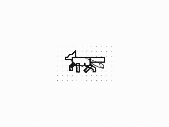
Using illustrator’s corner radius tool, I add some curves to the body and tail, and clean up the legs a bit.
The rear leg needs some special love, so I pull it out from the rest of the body. Using a quarter of circle as the shank, I make sure it matches the flow of the back of the body. I freehand the bezier curve for the front of the leg.
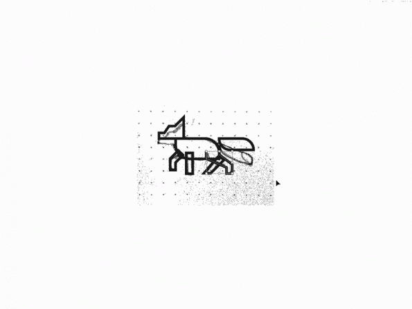
I rotate the tail, and add some fills to hide the back legs. You could use the pathfinder tool to join the head to the body, but in this case I just hid it with a white square since I didn’t want to lose the separate shapes just yet. I make sure the width of each leg is exactly the same. The fox is starting to look pretty good!
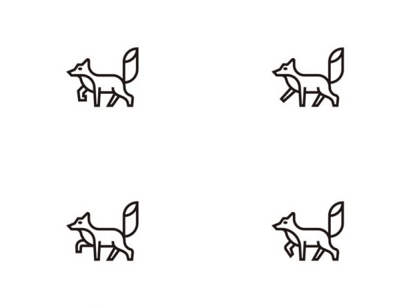
Step 4 Iterate!
Okay, so the fox is at the point where what’s in my head matches what I put down on paper matches what’s on the computer. But I still want to make sure I’ve explored all variations possible so that I know I’ve arrived at the best solution. This is where the computer trumps the sketchbook simply because of copy/paste.
I add some more curves to the neck, but I’m not quite happy with the head and ear so I duplicate the fox a few times and explore some different shapes.
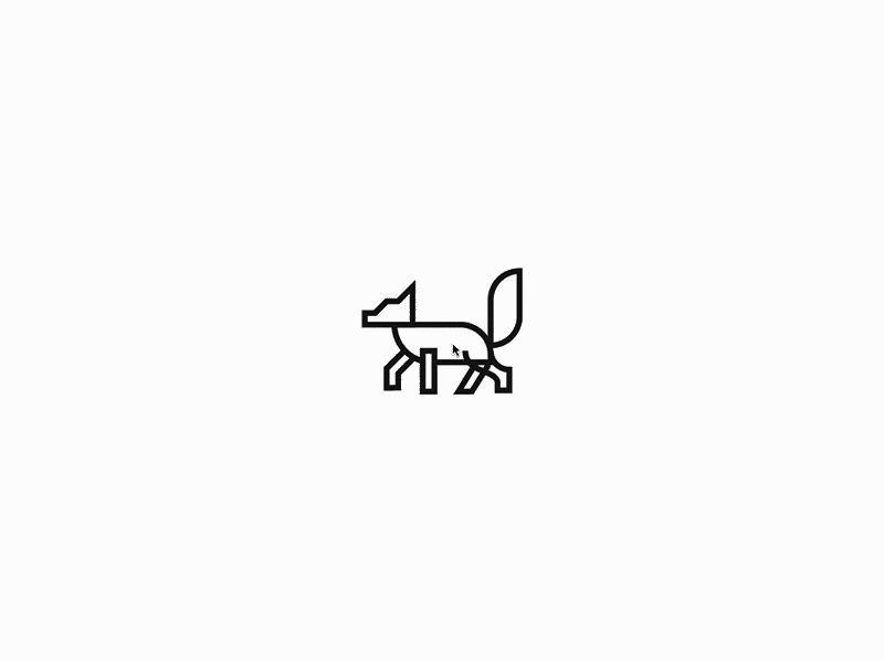
A secondary curve is added to the neck to help separate the white fur on a fox’s chest. I also play around with the front foot. There was something about it that just wasn’t sitting right with me. The front foot turns into an arrow shape that helps give the fox some movement and dimension.
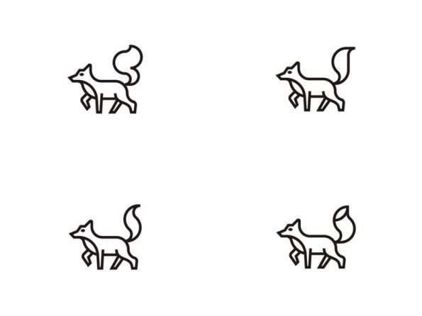
Getting close, but the tail felt too rigid and stiff, so I tried out a few variations with more flow.
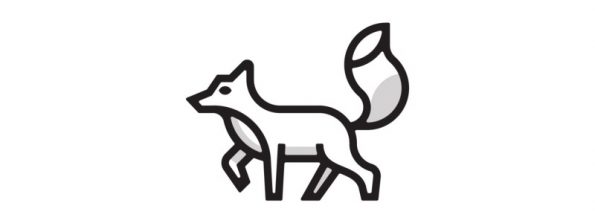
I outline all the strokes and merge everything using the pathfinder tool. I grab all the corners and add a 1px radius for a softer look. This is something I typically do when working with thick strokes to make them less harsh. I add some shadows — black set at 50% opacity so they work for any colour.
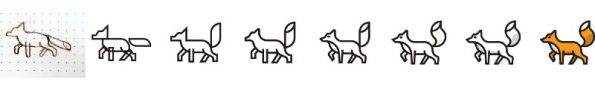
Lastly, I explore some colour options. I start with OpenStack’s brand colours and figure out an orange that will mesh well with the palette as a whole. I don’t want to use more than 2–3 colours, as any more than that would muddy the icon, and it would lose its punch. In this case, I stick to orange and white.
A good icon set takes time to develop. As a whole, the set should align to the brand vision, be visually cohesive, and feel like part of the same family. Individually however, each icon needs to be unique and effectively communicate what it’s representing. That’s what makes designing icon sets challenging, but it is worthwhile for companies looking to take their branding to the next level. A custom icon set creates a unique language tailored specifically to enhance a brand’s visual identity.
You can also view more of the OpenStack icon project here.
About the author
- How I design custom icons - July 23, 2018