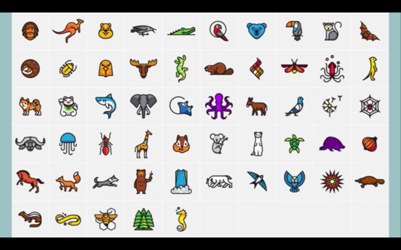
Coming soon to a laptop near you: Cute, fierce, funny and unique creatures of all kinds. The stickers depicting cartoon illustrations of nearly 60 animals, birds, bugs, fish and other natural features are OpenStack’s new project logos. You can check all of them out and download them on the Project Mascots page.
While some of the creatures are a zoology lesson themselves—meet the Quokka, Zorilla and Pangolin—the stories behind the creatures are even better.
For example, Quality Assurance selected the little brown bat because it eats its weight in bugs every day, and QA is all about bugs. Likewise, messenger service Zaqar aptly chose the carrier pigeon (pictured above), which was once entrusted to carry missives. Telemetry, the monitoring service, chose the Meerkat for its signature watchful posture.
Some project mascots carry a clue to the project’s purpose in the design of the creature itself. Keystone, which protects security, has its sea turtle’s shell subtly shaped like a shield. Glance’s chipmunk’s cheek is packed full of nuts, to resemble the goodies imaging service Glance packs away.
The translations team I18n not only chose the very verbal parrot for a mascot, but also requested it be as colorful as possible to reflect the international nature of the team. The designers used common flag colors to further enhance the parrot’s international flair.
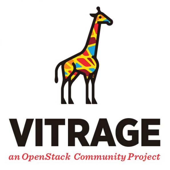
Vitrage views its project like a stained-glass window and so its giraffe traded typical brown spots for a skin pattern like a window. Release Management wanted to be sure its border collie is doing what it does best—herding everyone into the right place. And Cinder asked that we include the back end of a horse, to reflect their back end storage capabilities.
Some teams went for alliteration, such as Kolla’s koala (pictured below), Murano’s Muraena eel (check out its subtle infinity pattern), and Manila’s Zorilla. And some teams didn’t choose a creature at all, such as Requirements’ waterfall, Mistral’s dandelion, Nova’s supernova and Heat’s flame.
Why spend the time to create such whimsical images?
Instead of using just text or a boring icon to signify each project on official channels like OpenStack website, we wanted each project team to have its own unique identity and personality.
At the same time, we wanted to visually demonstrate that our projects are part of a cohesive, connected community. That wasn’t always easy—some teams had heated discussions about which mascot to select, or whether they would adopt a mascot at all. And some teams had existing mascots with deep roots in the project that the teams didn’t want to abandon.
We worked with a team of five professional illustrators to take all of the team’s chosen mascots and turn them into stylized cartoon images that would work well together, look good big or small, and could be used in a variety of ways. Nearly 60 teams received their logos just before the Project Teams Gathering in Atlanta, Feb. 20-25. A few teams didn’t select mascots or hadn’t finalized them yet.
The value of creating this family of logos is communicating that OpenStack’s projects work together—we’re part of a larger team. When this project began, less than one-third of projects had logos, none looked like they were part of the same family, and some needed professional tuning. Now, as a whole, they’re a vibrant way to represent our projects over 15 releases of OpenStack software.
- OpenStack Days Melbourne: a tipping point in cloud technology - June 5, 2017
- OpenStack Summit veterans share their best tips for newbies - May 1, 2017
- OpenStack User Survey shows wider adoption, larger clouds - April 24, 2017

)


