Great brands need great logos. Simple. Distinctive. Endlessly adaptable. Check out the evolution of virtually any major brand’s logo and you’ll see a trend toward simplicity as designers distill the essence of the brand into a distinct shape and typeface.
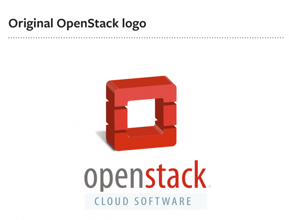
As OpenStack has grown and matured rapidly in its six-plus years, the brand is evolving with our community. Our original logo’s iconic O was a heavy, three-dimensional stacked block with a shadow, adding weight and presence to the pictured object.
But OpenStack is used in so many ways— the Big Tent now numbers more than 60 projects and our logo is used on hundreds of supporting companies’ websites, in our commercial trademark logo licensing program and in emerging programs such as the Certified OpenStack Administrator designation.
We needed a simpler, more robust logo that could support these diverse applications.
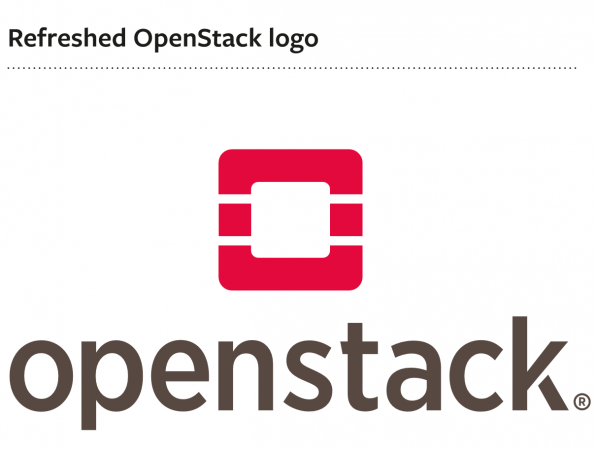
Enter our refreshed logo, presented to the OpenStack community for the first time here at the Barcelona Summit:


Design insights
Our design team, led by OpenStack’s creative director Todd Morey, preserved the iconic stacked, squared O, but flattened the O to a two-dimensional shape in keeping with modern design trends.
What’s “flat design?” You’ve probably seen it in your smartphone’s icon set—icon images that were once designed to look three-dimensional and as lifelike as possible, full of texture and shadow, are now adopting a simpler look and feel. Shadows are created from colored shapes rather than a drop-shadow, and gradients have replaced texture.
If all of that sounds like design gobbledy- gook, never fear. What you need to know is that the new OpenStack logo will look great and be easy to replicate across the web, various logo uses, on swag and in print.
Here are the most important takeaways for our community:
- OpenStack is getting a fresh, modernized logo based heavily on our original logo. The primary change is it looks two-dimensional instead of three-dimensional.
- We’re unveiling this new logo at the Barcelona Summit, and will subsequently release design assets to the entire community.
- We encourage everyone to adopt the new logo by the Boston Summit in early May 2017.
Want to download the logo?
Go to openstack.org/brand to learn about acceptable logo uses and ensure you’re abiding by our community’s responsibilities for using the OpenStack brand.
If your company has already signed our commercial logo trademark agreement and you’re using the old logo on your company website, you’re welcome to download and update that logo to the new version, found at openstack.org/marketing.
We will be supporting our marketing community in particular to help make this transition as seamless and painless as possible by hosting some community education meetings and will provide more assets beyond the logo at openstack.org/marketing. There, you will be able to find assets such as a Powerpoint template with the new logo and visual identity.
This article first appeared in the print edition of Superuser magazine, distributed at the Barcelona Summit. If you’d like to contribute to the next one, get in touch: [email protected]
Cover Photo // CC BY NC
- OpenStack Days Melbourne: a tipping point in cloud technology - June 5, 2017
- OpenStack Summit veterans share their best tips for newbies - May 1, 2017
- OpenStack User Survey shows wider adoption, larger clouds - April 24, 2017

)


